

John Lewis & Partners - Design system
Driving visual consistency and brand identity through the development of scalable design systems, strategic thinking and guidance.
Starting at the beginning. Team collaboration.
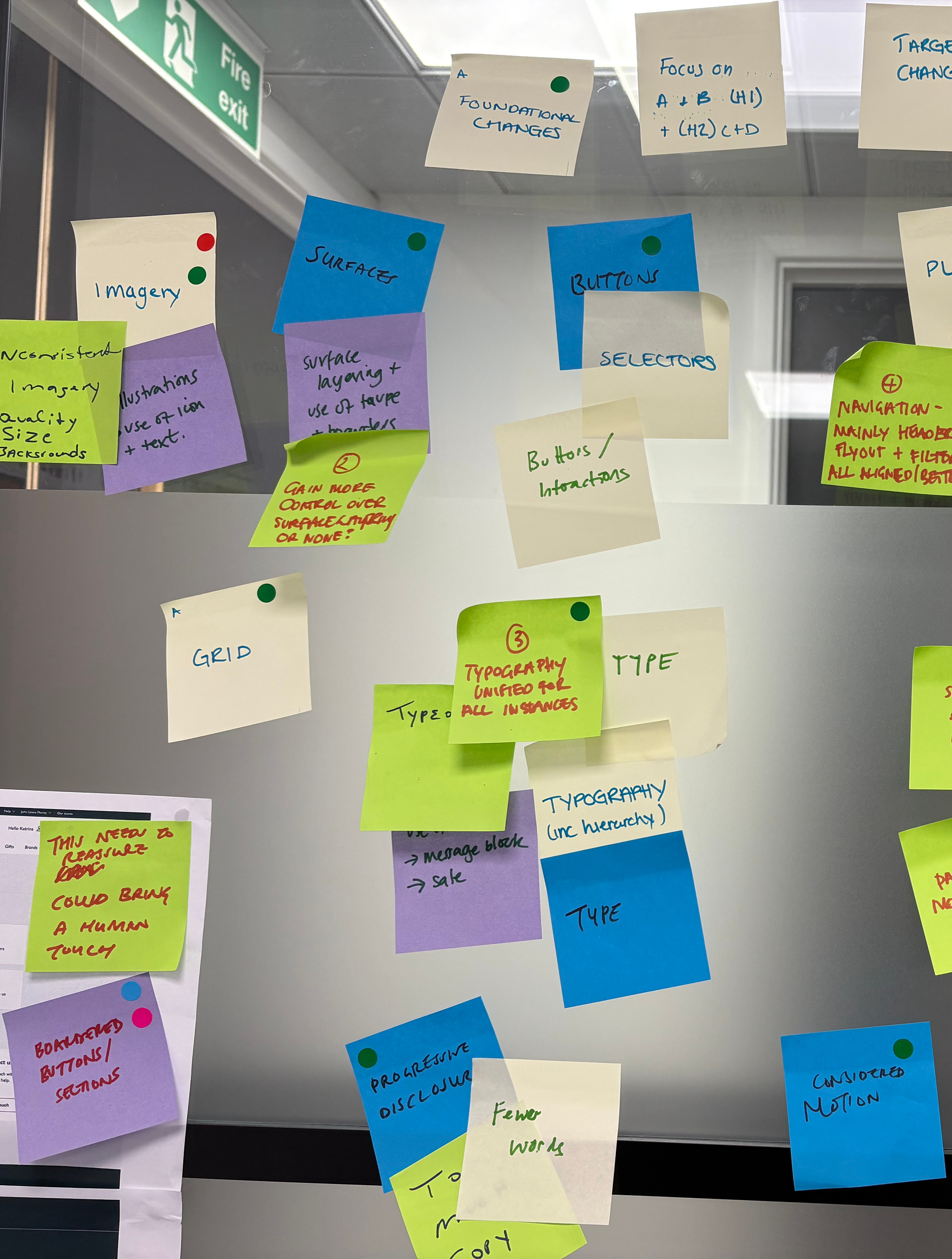
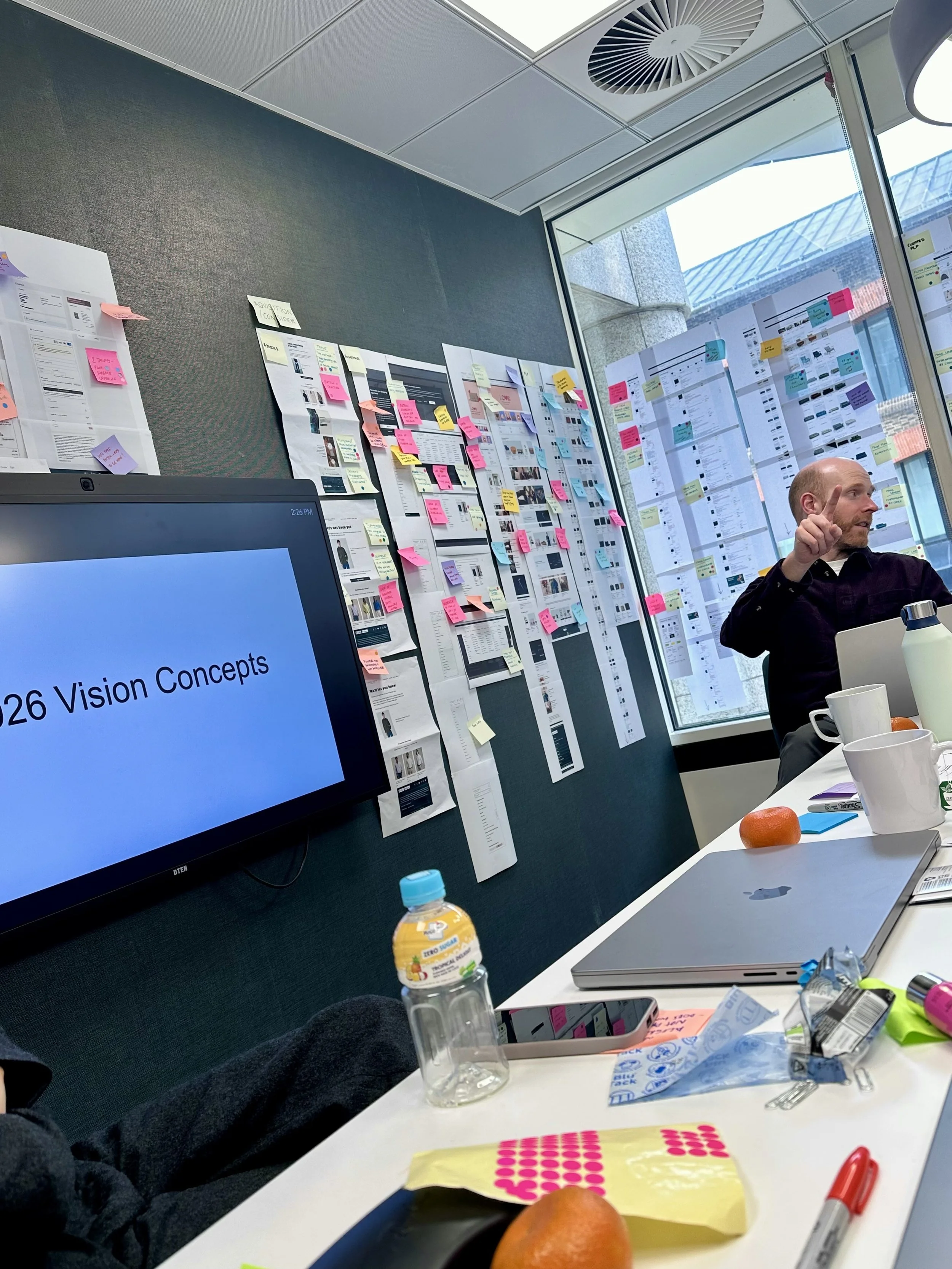
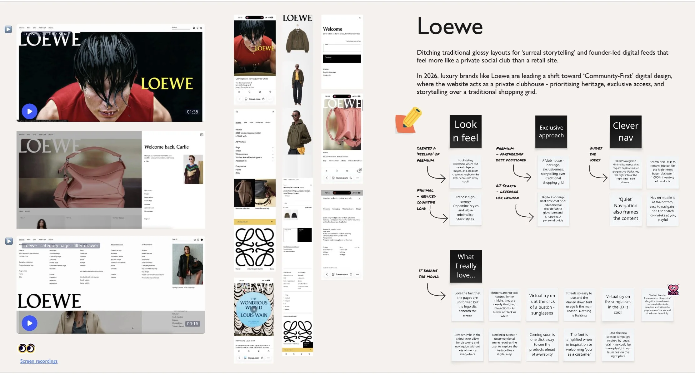
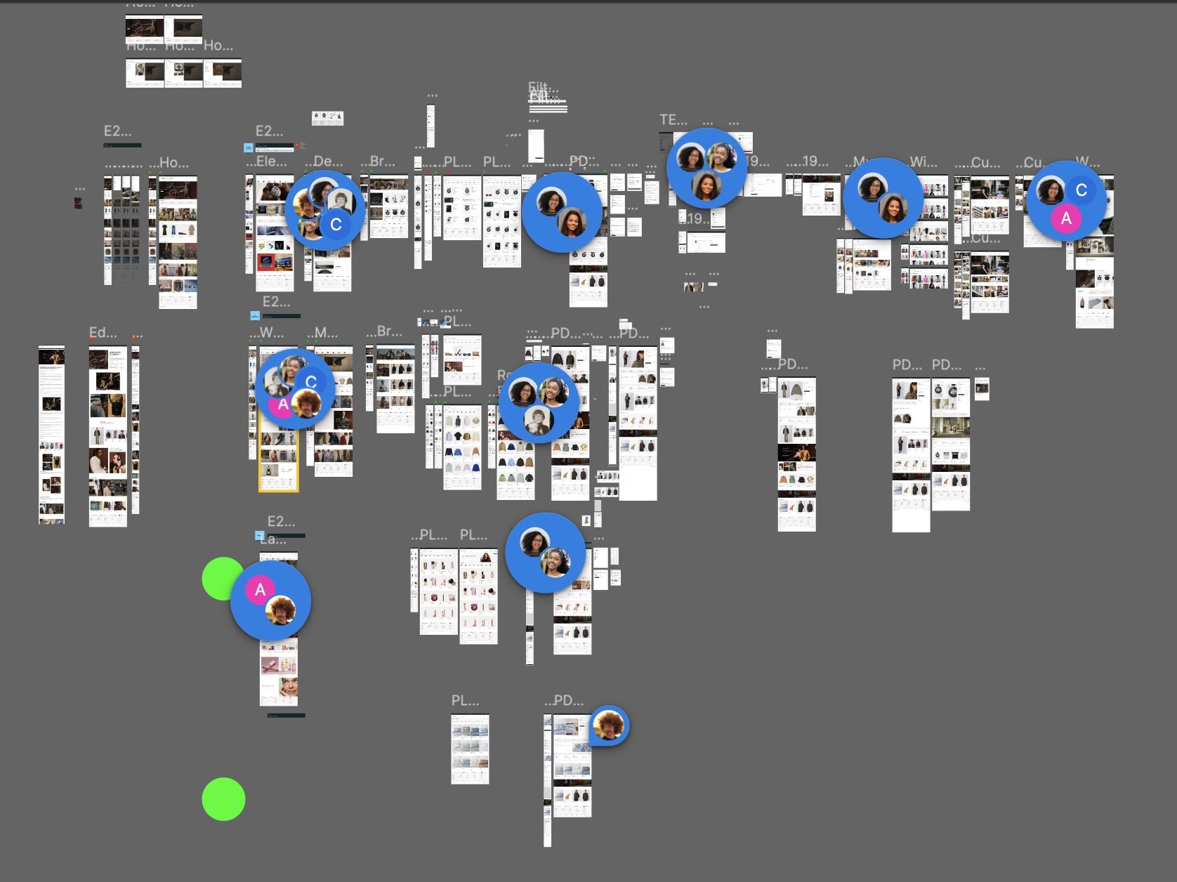
A team day was dedicated to auditing the design system and spotting friction. Benchmarking against a top competitor also provided insight into industry standards.
Minimalist design creates a strong, intuitive visual hierarchy
A robust and intuitive visual hierarchy has been established in the interface through the deliberate choice of a minimalist design philosophy.
Before
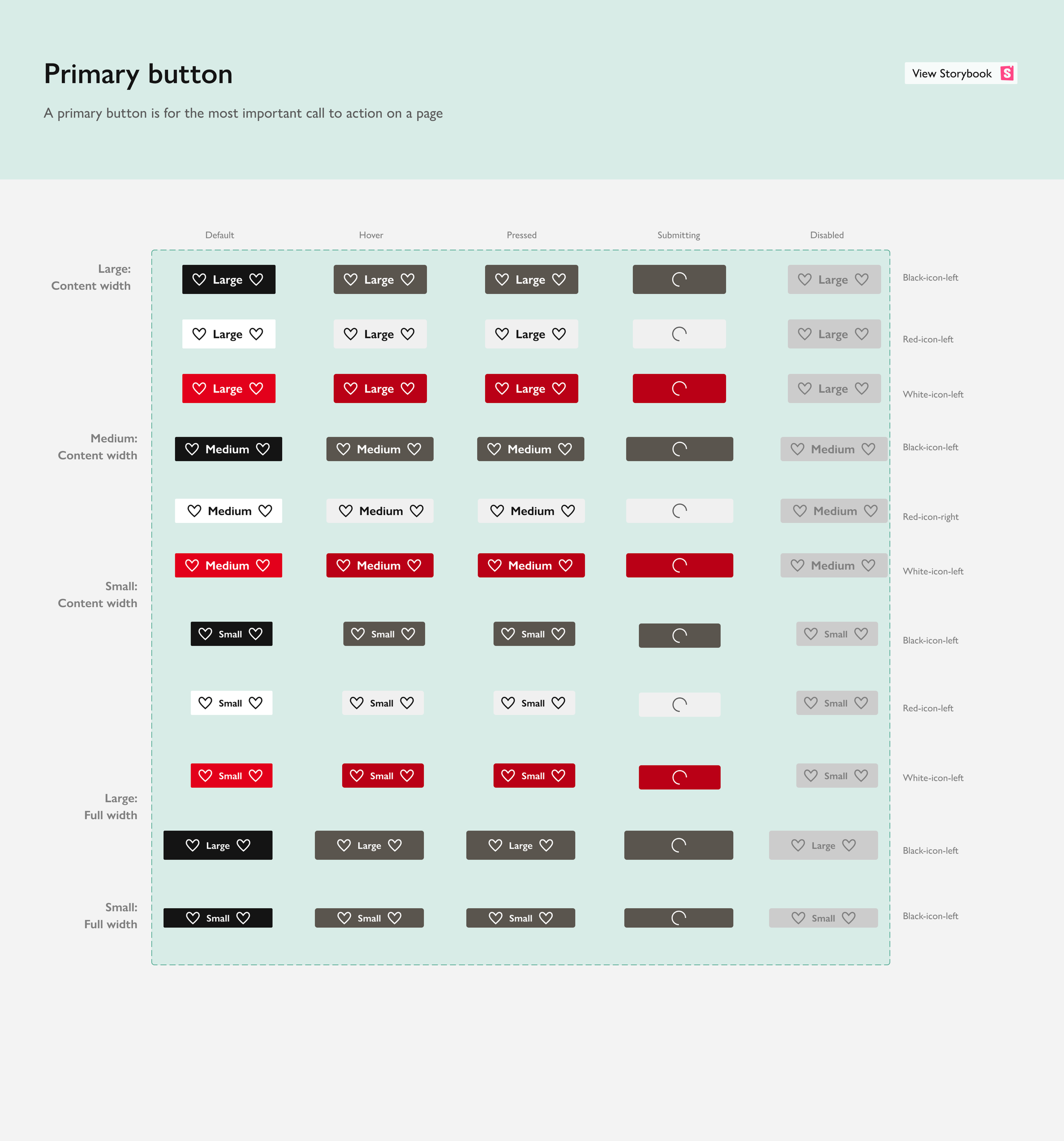
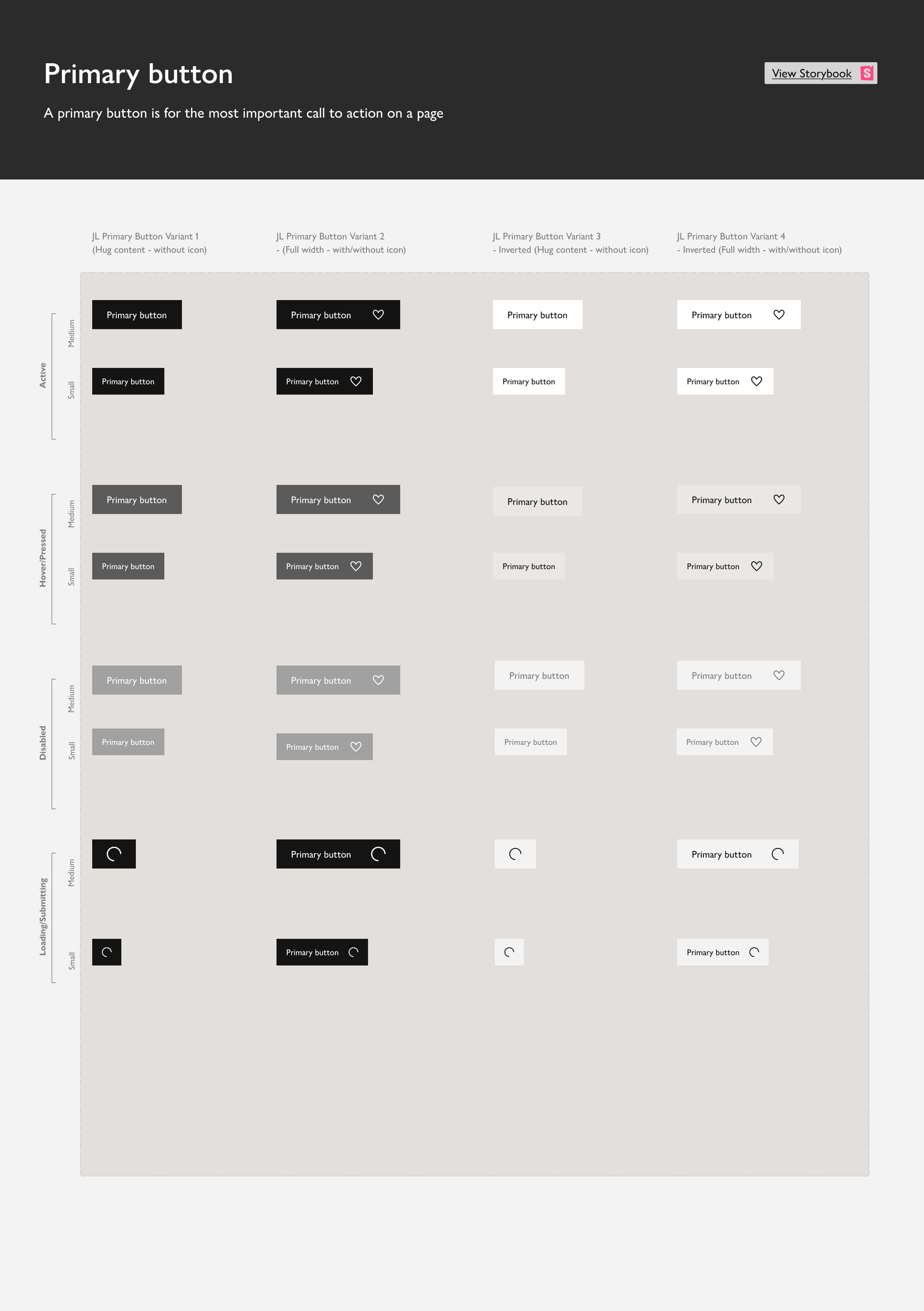
The goal was to ensure the primary call-to-action remains unmistakably prominent. This structured approach provides the clarity essential for a seamless user experience.
After
Uniform, familiar elements make navigation simpler and rewarding
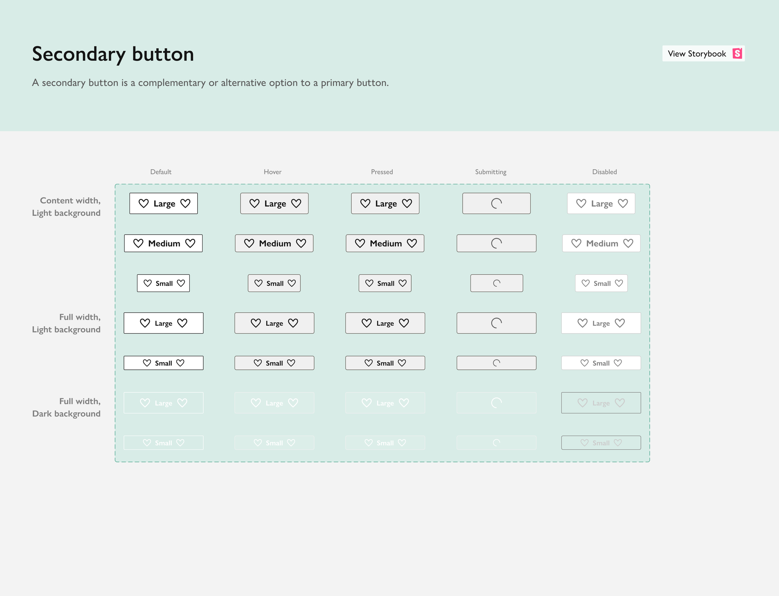
Consistency wasn't just about visual polish; it was about helping people navigate with confidence. Familiar patterns reduced cognitive load, while subtle micro-interactions created a more considered and rewarding experience.
Before
Maintaining a vital level of consistency is achieved by aligning every textual and visual component, such as font sizes and icon proportions, with the updated design language.
After
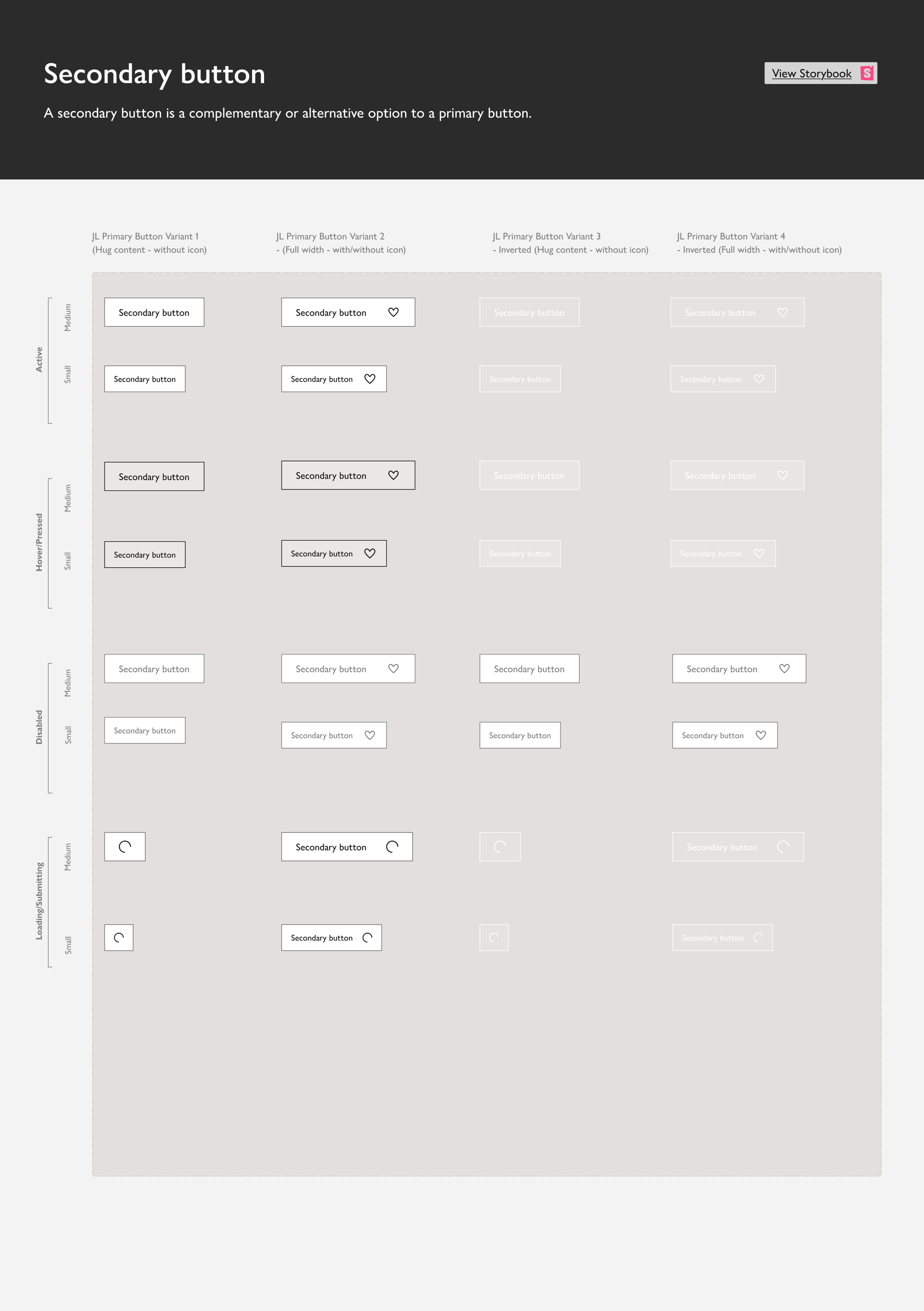
The preliminary phase focused on defining interaction patterns and developing a standardised button system. These designs incorporated subtle details designed to honour the brand's heritage, though specific details remain restricted under a non-disclosure agreement.
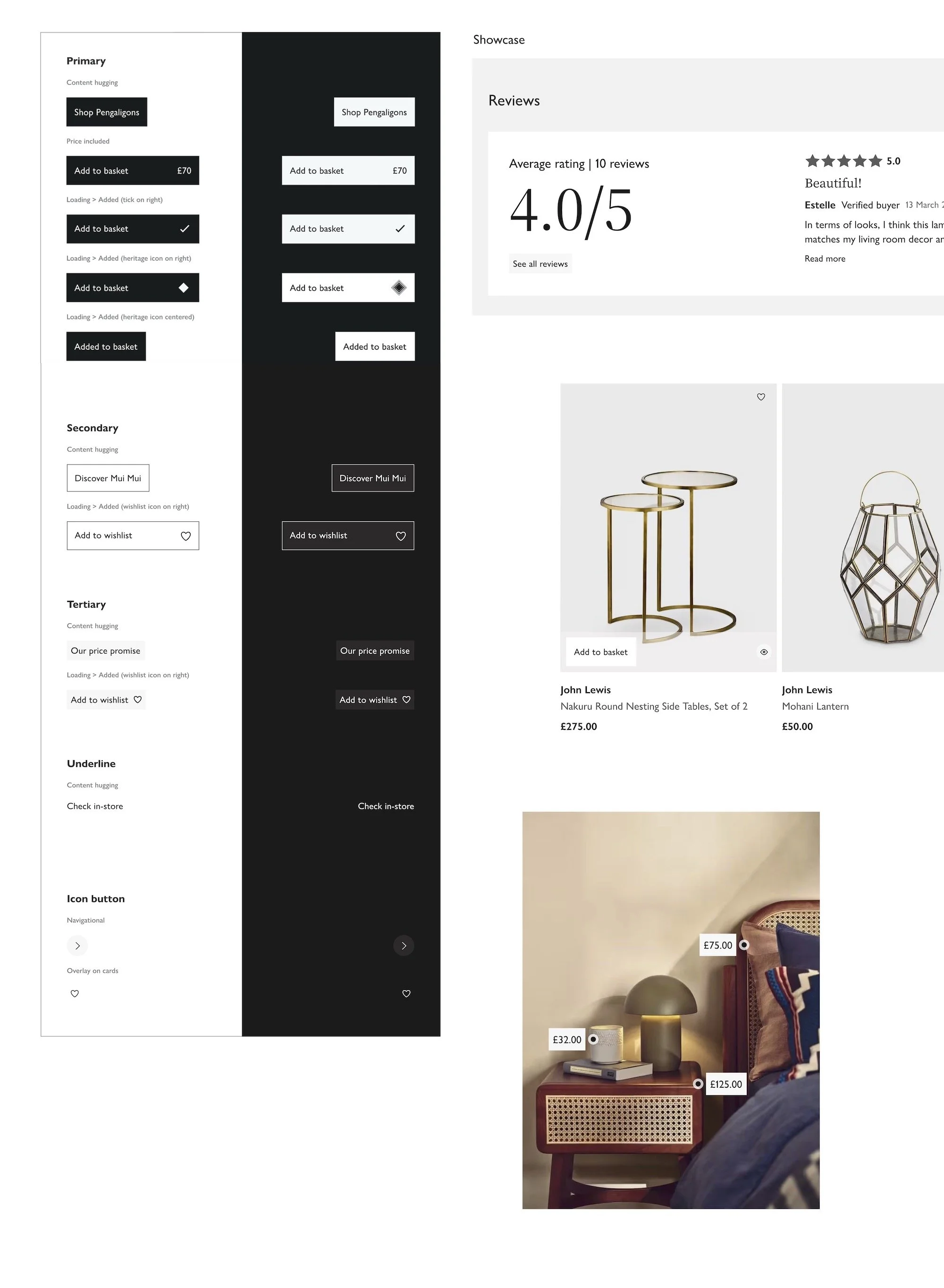
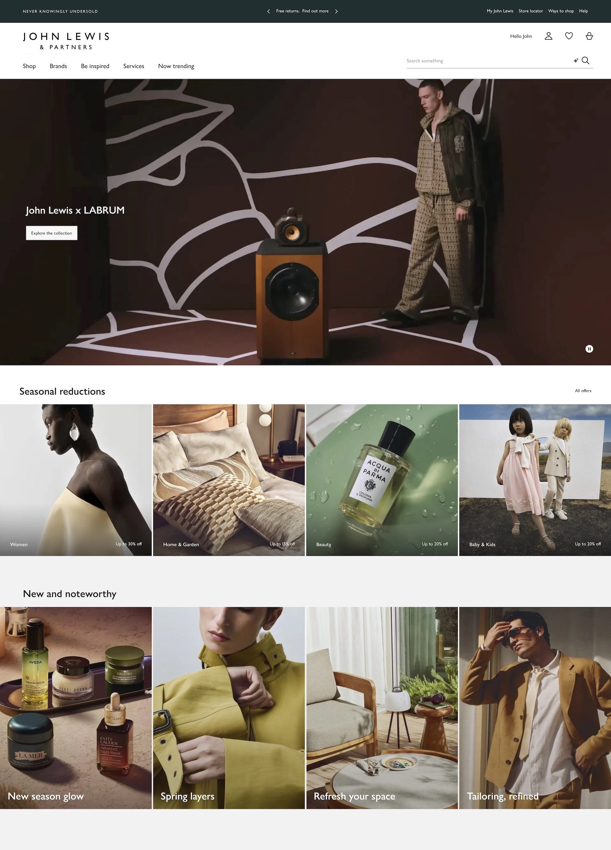
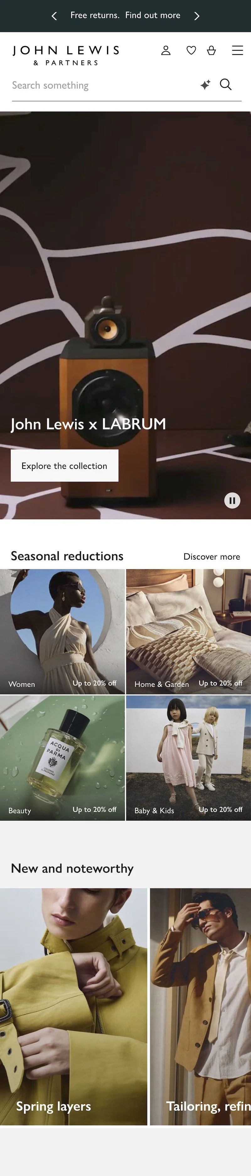
User feedback on the 2026 direction of the design system
The process
To evaluate the new visual direction, 16 regular John Lewis customers provided feedback via mobile and desktop prototypes. They were divided into four high-engagement groups.
The methodology focused on:
Defining ‘premium experience benchmarks.
Comparing homepage aesthetics between current and redesigned versions.
Auditing navigation, categories, and product layouts (PLP/PDP).
Assessing the new visual language's effect on brand perception.
The results
The new designs were perceived as more ‘premium’ then the current versions, with participants praising clean layouts, side drawers, and impactful imagery.
Validating the aesthetics, feedback also identified usability issues, such as scroll and navigation friction. These insights established a clear roadmap for A/B testing and iterations, balancing high-end visual goals with functional clarity.
The designs in three words
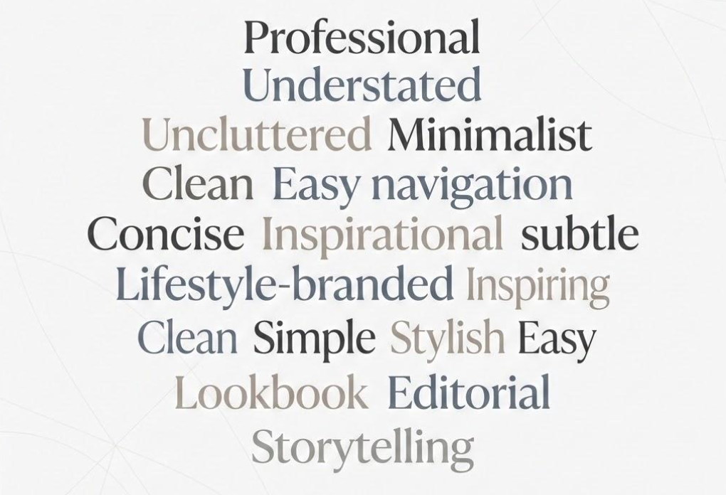
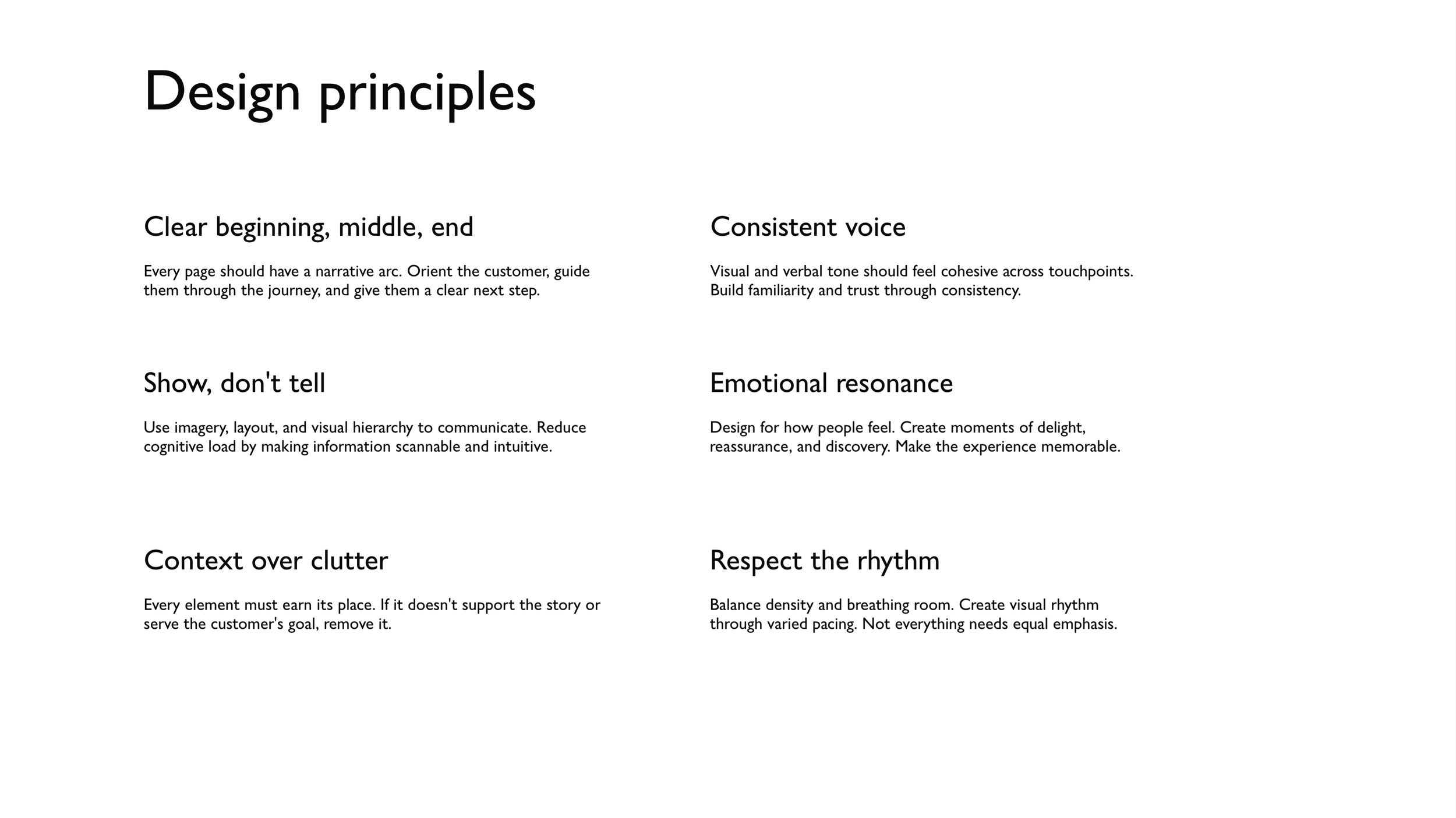
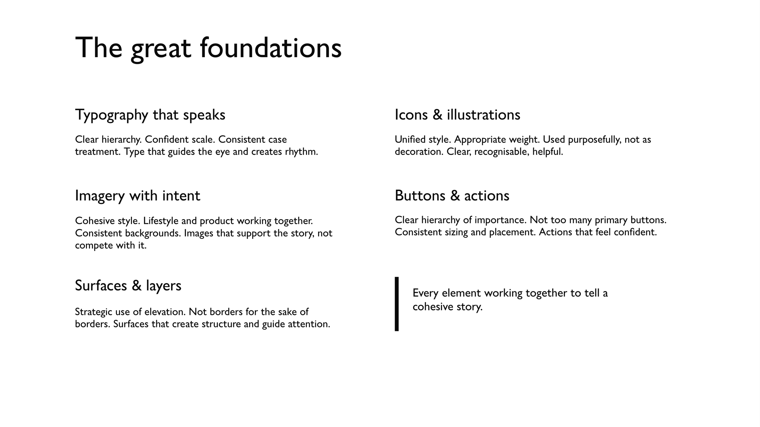
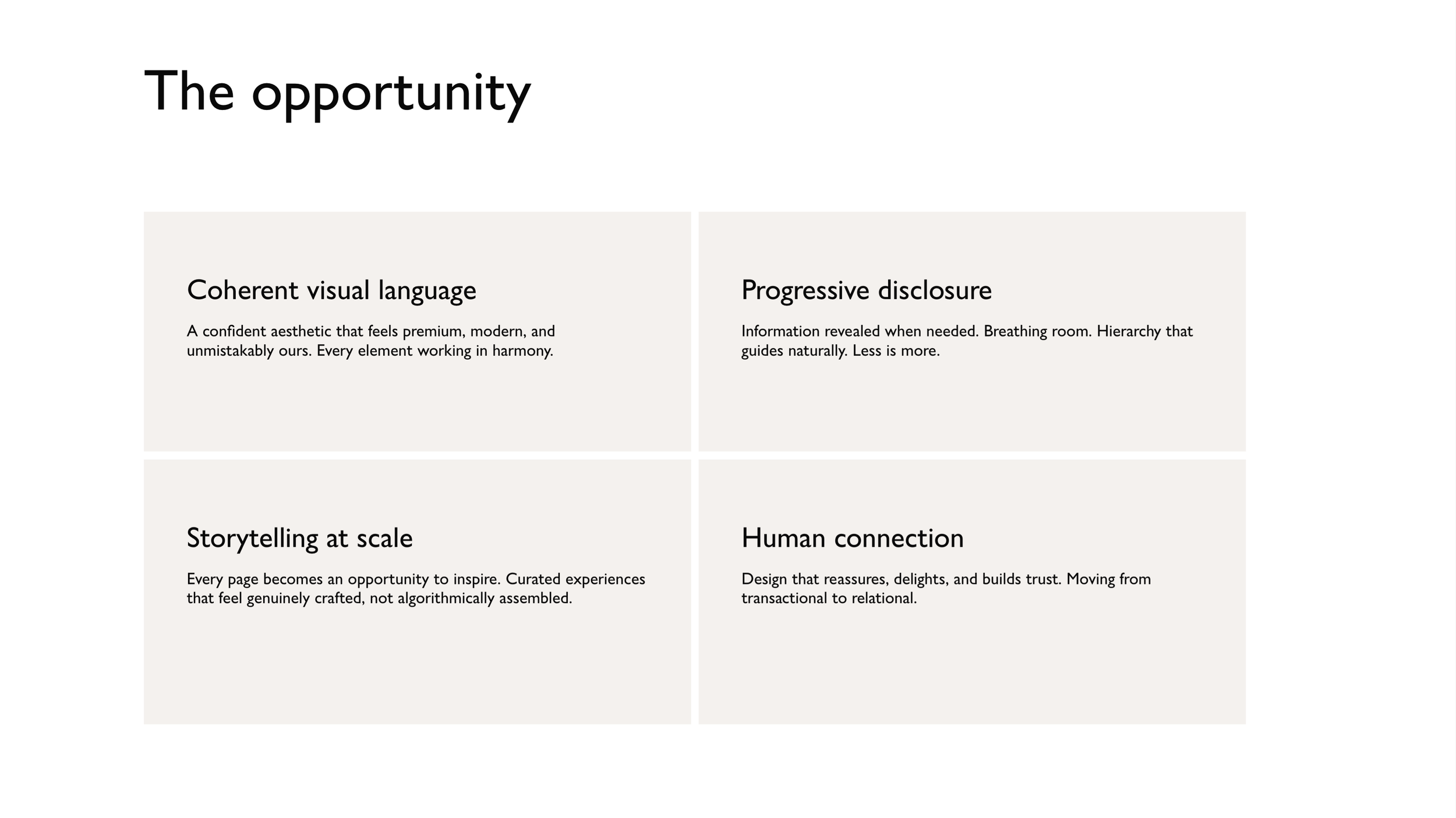
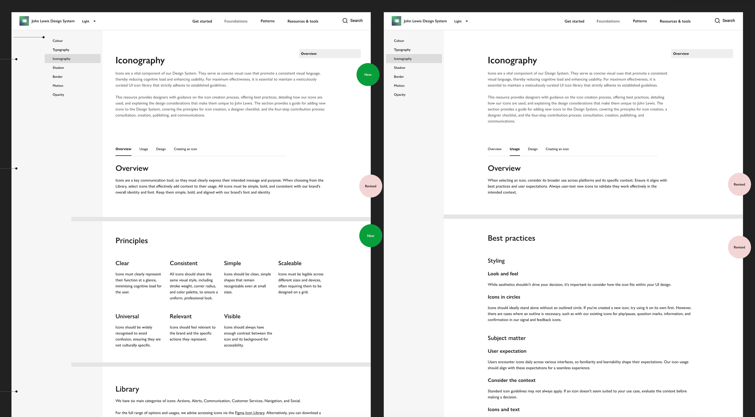
Example of guidance on Zeroheight
Deliverables:
Defined UX/UI vision and E2E prototypes.
Developer handoffs and scalable design tokens.
Defined principles to increase design system integration.
Standardised workflows and guidance on Zeroheight.
Produced whilst at John Lewis & Partners.